Behind every research group there are diligent helpers most of whom are still students. As for our project, there are three German student assistants working with us. Today’s blog is dedicated to their work, giving each one the space to introduce themselves and to explain their duties within our project.
The first to join the ATLAS project was Jill Lilian Fischer, already from the start of the project in April 2021 during her third BA semester at the university. Currently she is a first semester MA in History. One of the first (and continuing) tasks was to translate the blogs into French. Humble as always, she wants to add she is no native speaker. In addition, she has done quite some work curating bibliographies and entering references in our Zotero database. Since this year the main task has become digitising maps and data using QGIS. As a true fan of maps in all kinds and forms (historical and fantasy), she was more than happy to learn QGIS and explore its possibilities to create new maps.
As there was ample work to do, Tjaard Jantzen, a student of history and mathematics for school teaching, joined the ATLAS project in October 2021. He is currently in his first semester of the Master of Education. Since joining ATLAS, he spends most of his time filling Excel spreadsheets to digitise and sort epigraphic data, which then can be transferred to the database. He is also responsible for borrowing and obtaining books that contain relevant data. Furthermore, part of his work is the research of citations in the ancient literary sources that relate to the case studies of the project. Like Lilian and Sebastian, he completed a course on map creation in QGIS in the spring of 2022 and has enjoyed creating and digitising maps for the ATLAS project ever since.
Most recently, Sebastian Meyer joined the student assistant team in April 2022. As a student of history and mathematics for grammar school teaching, he is now a first semester in the Master of Education. Shortly after joining the ATLAS project, he took part in a course together with ATLAS student assistants Lilian and Tjaard to learn how to digitise maps with QGIS. Besides bibliographic work, mainly with the Zotero database, his main activity since then has been to digitise maps for the project.
Learning how to digitise and create a map
When we first started working with maps, we were all disappointed. The glorious work we were supposed to spend our time on was a simple excel spreadsheet which, of course, didn’t look like an atlas or a map at all. What we were doing was a work that was either tiring (a lot of copy pasting) or unspectacular (combing loads of literature just to find out a certain inscription was surprisingly carved in stone). At first, we didn’t know why we were doing this. Sure, it’s nice to know the exact coordinates of an ancient city or the location of an inscription. But wasn’t the project about maps and cool stuff like that?
So, then Pieter introduced us to QGIS (see the online course). And soon, we were going to learn how an excel spreadsheet would turn into a beautiful map that is not only accurate but customisable.
Import of Excel data
There are two ways to implement the positions of cities we would like to have in our maps as point layers in our QGIS program. For the first one, we create a point layer and manually set points to represent the cities. The problem is that those points remain inaccurate as we cannot guarantee that the cities are exactly where we think they are (even with a georeferenced map as a basis which will be discussed later on).
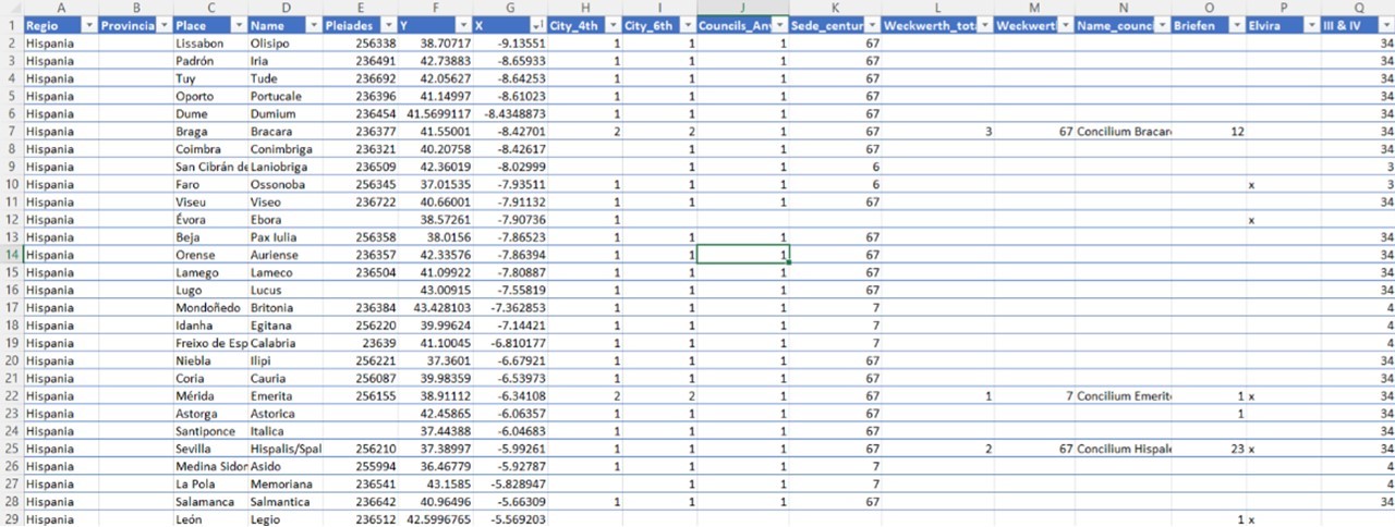
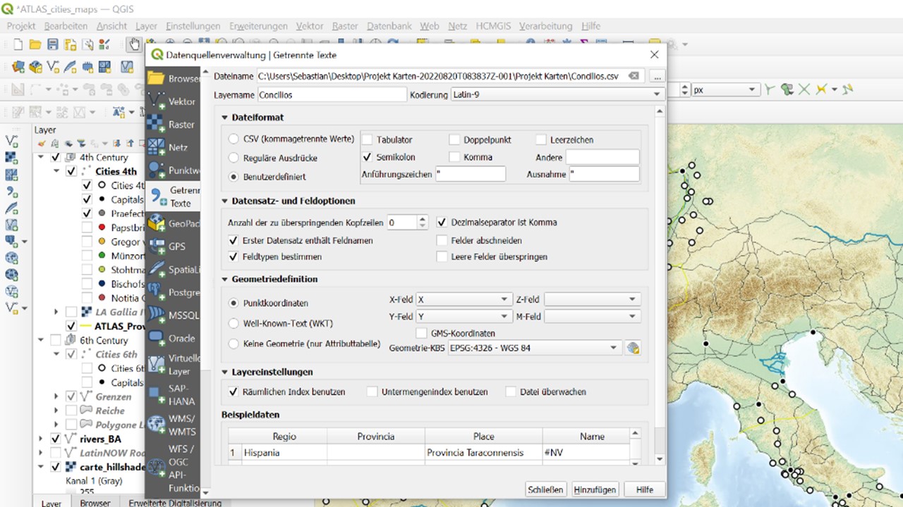
Thus, during their first tasks with QGIS, the three student assistants quickly realised why Excel spreadsheets, so sacred to Pieter, play a crucial role in the ATLAS project. Through the coordinates that were fed into the Excel files, QGIS provides the function to add a “delimited text layer.” By specifying the columns where the X (longitude) and Y (latitude) coordinates of our cities are located, we thus have the wonderful opportunity to implement the cities in QGIS true to their locations. In addition to the accuracy, this offers the further decisive advantage that all further information of the table has already been added to the layer and can be flexibly revised and supplemented via Excel. This makes the creation of specific maps much more flexible for QGIS users.
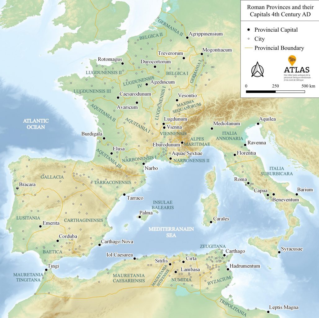
For example, one of Sebastian’s tasks at the end of last year was to make thematic maps of Gaul. Using information on the cities of Gaul, Sebastian created maps that show us the cities mentioned in the Notitia Galliarum (4th to 6th century), Gregory of Tours (6th century) and minting cities (4th to 6th). That information had all been implemented through a new column in the Excel spreadsheet. After coding with a “1” in the row of the Gallic city when the criterion applies, one can easily transfer the desired information as a sublayer into our QGIS file via the filter function.
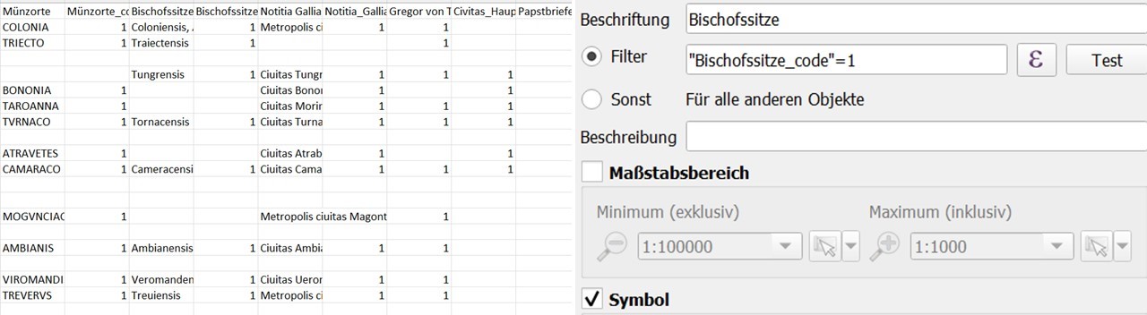
(Data from Jürgen Strothmann (Hrsg.), Civitates, regna und Eliten. Die regna des Frühmittelalters als Teile eines „unsichtbaren Römischen Reiches)
Excel spreadsheets are the easiest way to feed our map with precisely located places. However, cities alone do not make a map: we still need rivers, roads and boundaries, especially in an ancient context. So, the second big step we took was to learn how to digitise printed maps to make use of their content which isn’t necessary bound to a single location as cites are.
Georeferencing a map
Following our tutorial, we used a printed map to create a new data set for provincial boundaries. The first step is always the same: If we want to use the content of printed map (e.g., the boundary lines of 4th century Gaul), we have to match the coordinates of the printed map with our QGIS map. Ideally, we link the location of a city or a significant landmark to the corresponding point in QGIS so that QGIS is able to tie the scanned map to its own map-layers. This could potentially look a little strange – printed maps are often not truly scaled or compressed to fit better in a publication. There are even examples where this way of georeferencing a map doesn’t work. Plenty of maps are too inexact or the places are only vaguely in the right place. QGIS is, in the end, a and certainly not known by everyone, so it does not surprise that most maps are not exactly georeferenced.
After georeferencing a map into QGIS, we could digitise its content as we wish, using point layers for places, line layers for roads and boundaries and polygon layers for seas. In the end, we have the layers to create a map that is either a georeferenced version of a once vaguely drawn map or a map that contains data from multiple sources. The map, however, is still no real map as you would imagine in a traditional atlas. It’s more comparable to a Google-maps: You can zoom in and out and it’s not necessarily as aesthetic pleasing as a printed map would be. This leads us to our last point: Creating a map that is ready to get published.
The beauty of maps
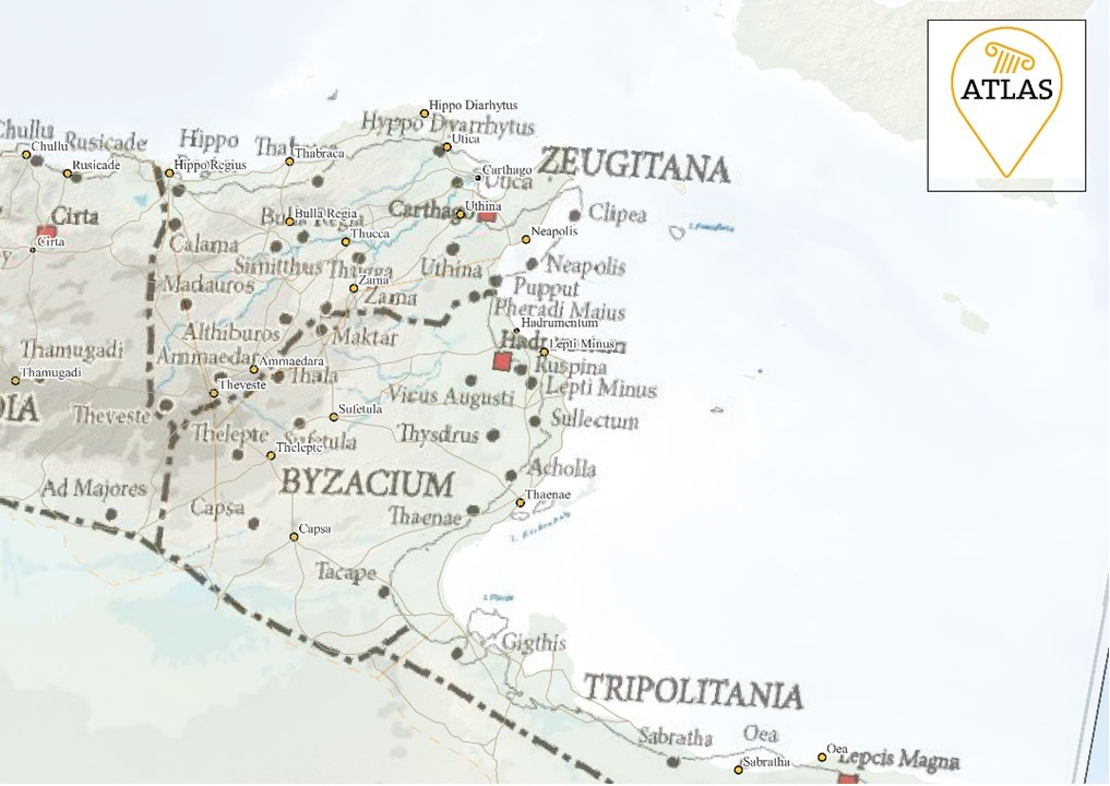
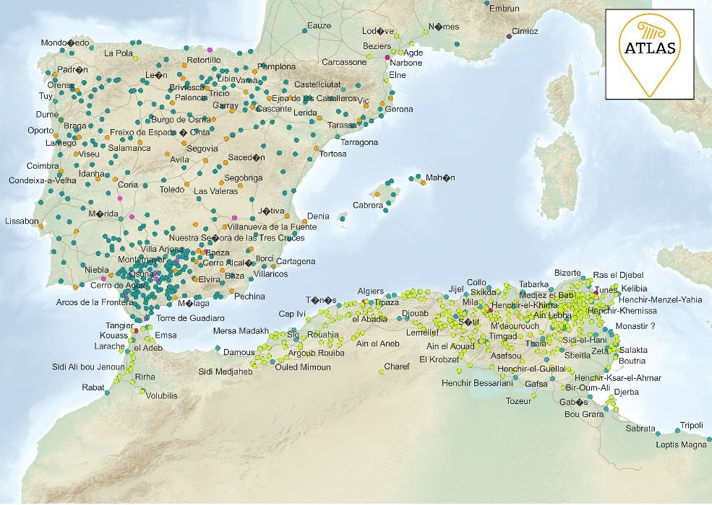
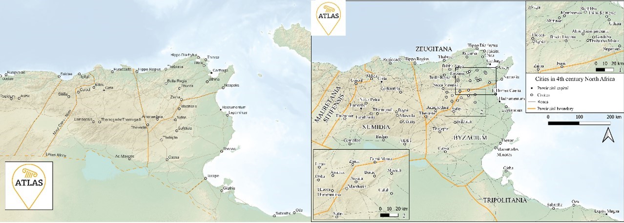
As the work progressed, each student assistant was eventually given their own area for which they would produce maps in the near future. ATLAS is, as you all know, focusing on three regions. While Sebastian complemented the spreadsheet for Gaul, Tjaard and Lilian combed through lots of publications to find inscriptions located in North Africa and Spain. In the end, Lilian has chosen North Africa as her “map speciality” and Tjaard was responsible for ancient Spain.
Each of the three was now faced with the task to finalise a map so it is ready to get published. In the next few months we will publish maps from our work via the Maps-to-go page.
Fortunately, QGIS has a tool to create a print layout of your map layer. It’s relatively easy to handle and allows to create an image (Jpeg, Png, tiff and many other formats) of your map which can be read by every computer without installing QGIS and, of course, which can be printed and therefor published. With the layout manager it’s also possible to create different maps all based on the QGIS map. The components of the print version of the map depend on the layers that one decides to activate. Thus, every map contains exactly what one could wish for.
But, as always, there is a snag. Wouldn’t it be easiest when someone could use the labels created by QGIS? It’s actually possible to do so – but the outcome is not quite satisfactory as you could clearly see in the picture.
In ATLAS, we also thrive to use a harmonising design for our maps: yellow boarder lines (yellow is the colour of ATLAS!), a background that feels a bit like a painted map and city symbols that are simple but easy to recognise.
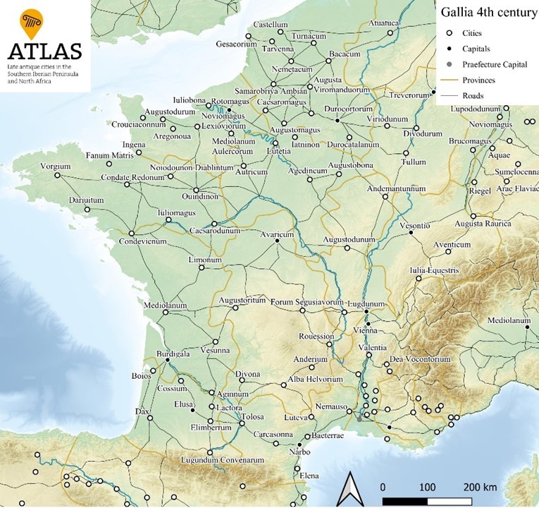
Having this in mind, the student assistants needed to give the map a last fine tuning. Instead of just enabling the labels, they create new text fields for everything that needs a name, allowing to move, rotate and scale the labels as wanted. The only problems they still must face is the fact that not every region is equally easy to depict. For instance, creating the map of Gaul is satisfying in its own way: France has an ideal form to fill out the map layout while still leaving enough space to add a legend. The Roman cities are evenly spread across the provinces and there is enough space for (almost) every city to be labelled appealingly.
Designing a pleasant map of North Africa is less simple as it contains lots of cites in the east which are often close together. But there’s always a solution. Thankfully, the QGIS layout manager has a tool to add a second or even more maps. So, in the end you can generate a map with smaller detail maps to show the densely populated areas.
Finally, the printable map is in our virtually hands. The once excel spreadsheet is fed in a visual appealing layer that contains all necessary information and is individually customisable.
The work of student assistants is – although sometimes dull or tiring – satisfying and even creative. Once there is the need of a map with special elements, the three are able to create a perfectly matching map. The future of the project still brings lots of map possibilities that will task our student assistants. Behind the designed maps, the research groups work to add new precision and to interpret and analyse the atlas around our case studies. In the end, the maps are a useful and appealing tool to visualise certain research results and accompany our academic papers. If you haven’t already, feel free to look at our last maps and make sure to come occasionally as we try to update our maps as often as possible!